Can developers do UX designs?
How I guided developers on my team to design an API portal that everyone loved.
Background:
An Intolerance to Storybook
Our team had been using Storybook for a long time. It’s a free, open and popular library that allows developers to quickly put together UI component documentation — a quick and easy win to establish a new design system from scratch.
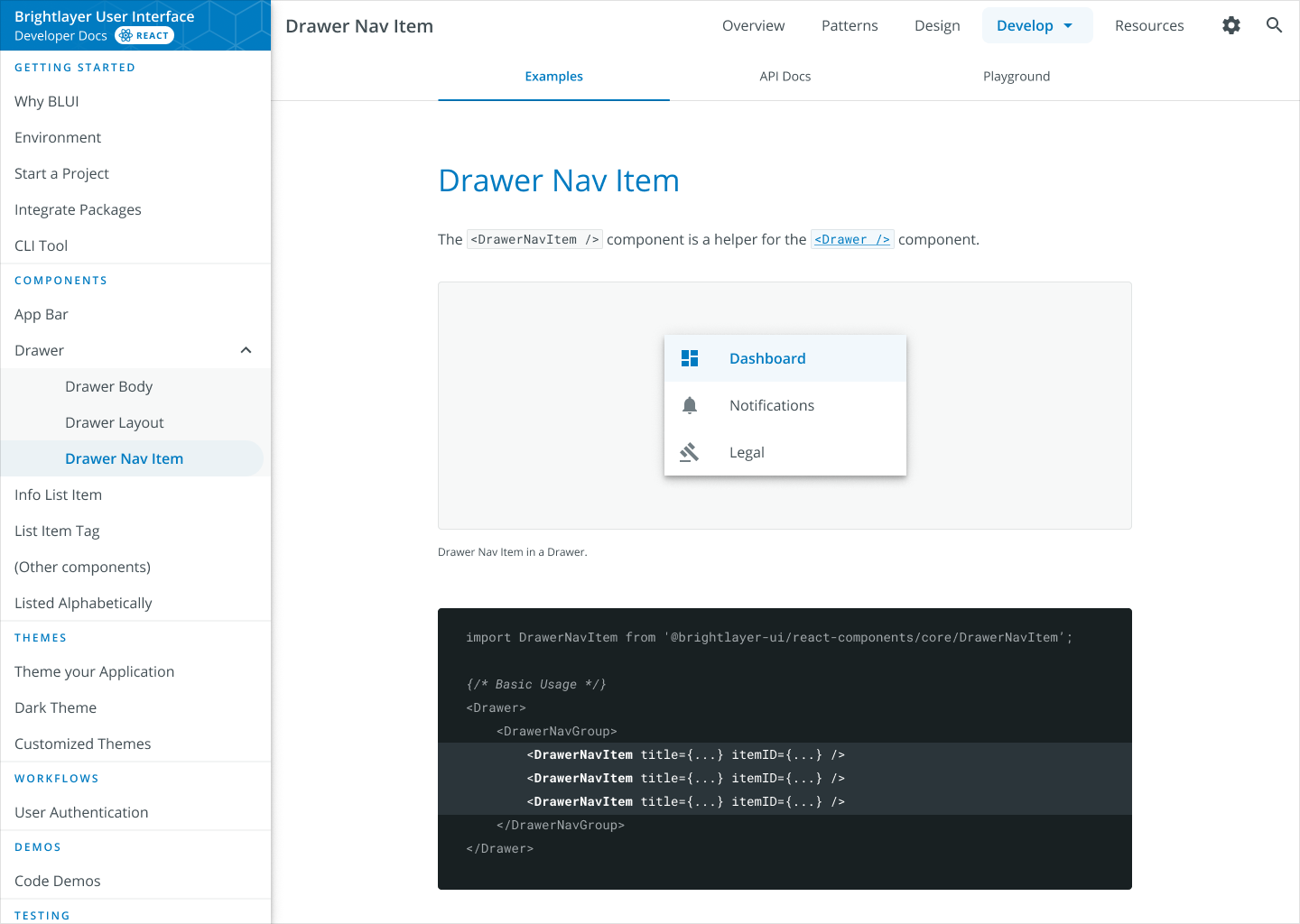
^ The existing project, scaffolded by Storybook
But Storybook is not well-designed.
The learning curve was steep — interactions and code snippets are more hidden than what we like. Plus, there were a lot of hacks and tricks needed to make it work the way we wanted.
It was like you spent a long time taming an innocent looking beast, but when you thought you are finished, it still bit you from time to time.
We decided to redesign and rebuild our UI component documentation website entirely from scratch to guarantee an optimal user experience and that the web app is always doing exactly we wanted.
My Role
Usually I would’ve solo’d the entire design process; however, two developers on my team had just completed their design thinking training and were getting excited about practicing their research skills. They were also interested in prototyping in Figma. So I decided to arrange the design thinking activities for them, and back them off near the high-fidelity stage.

Mentor
I educated developers what and how to think, instead of what and how to do.
UI Designer
I polished the final design and conducted user tests.
Project Manager
I exercised project management during the design-develop transition, helping
My crew is quiet. What can I do to help them be more active?
The two “engineer-designers” on my crew are on the quiet side and more accustomed to being on the “receiving end” during a design discussion. Whether it’s because they are not equipped with a designer’s mindset or they are too shy, I am determined to help them speak up.
Kickstart Workshop
To kickstart the project, I ran a workshop within my team. This brought three benefits:
(1) To establish a common ground and expectation
(2) To let everyone participate in the design process and understand better how design works
(3) To briefly survey people’s opinions
(4) To understand where people may disagree the most and prioritize subsequent activities
Participants
6 team members + myself
What I Learned
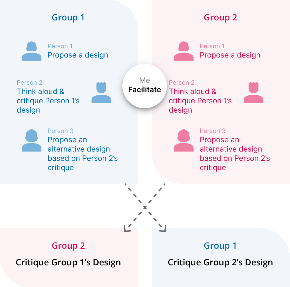
Leave enough time for people to critique.
To improve participation, assign team members to critique others’ work. I made the rule that the previous person must critique the next person’s work first before anyone else speaks.
Split the dominating members apart, but tell them “I expect you to take the lead to encourage others to speak up during the discussion”.
A brainstorming session, but
Everyone was forced to make comments at some point before the typical “thought leaders” were allowed to jump in.
A round robin session, but
I split the two people most likely to engage in discussions into two different groups and told them in advance that they would be the group leader who would take care of their group’s discussion, so that nobody overpowers anyone else.
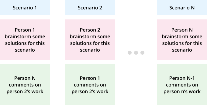
Card Sorting
I started by arranging my crews to do card sorting — we have offered so many resources to our “adopters”, but we didn’t know how they are perceived or if they are aware of these resources at all.

Participants
4 developers (each in their own sessions)
2 from adopter teams, to learn about how our existing assets are perceived
2 from my direct team, to understand how we want to promote our assets
What We Learned
People’s perceptions vary drastically. The team lead’s opinion does not always hold the most popular opinion.
Users agree with each other on the domain they are familiar with, but tend to just “throw everything in a large bucket” for the less familiar topics.
What I Learned
We were redesigning something big (talking about 30+ pages here). It might have been easier if we broke the card sorting into two steps instead — one step for the overall website hierarchy, and another step for what a particular persona cares the most about.
At this point, I noticed my crews were still turning back to me and asking for “an answer”.
Instead of following my designer's momentum and just telling them the answer, I asked them what they had learned.
This Socratic method helped further align our goals together and help my crews understand how to think like designers.
“All of them had drastically different opinions from our card sorting activity.”
“Yes, and…?”
“They all sorted testing topics together, but some chose to group by frameworks while others prefer to group by topics on the top level.”
“So what do you think is the reason?”
“… well… I guess people are more familiar with their own domain and tend to just throw the ones they are less familiar with together into one bucket?“
“Excellent. Next time you do card sorting with users, make sure to remind them to think-aloud and ask them follow-up questions if you noticed anything.
Now, what should be our priority here, to offer people quick access to their common resources or to give those less used assets more exposure?”
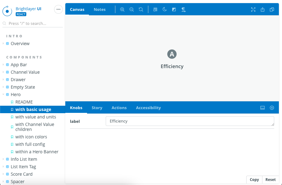
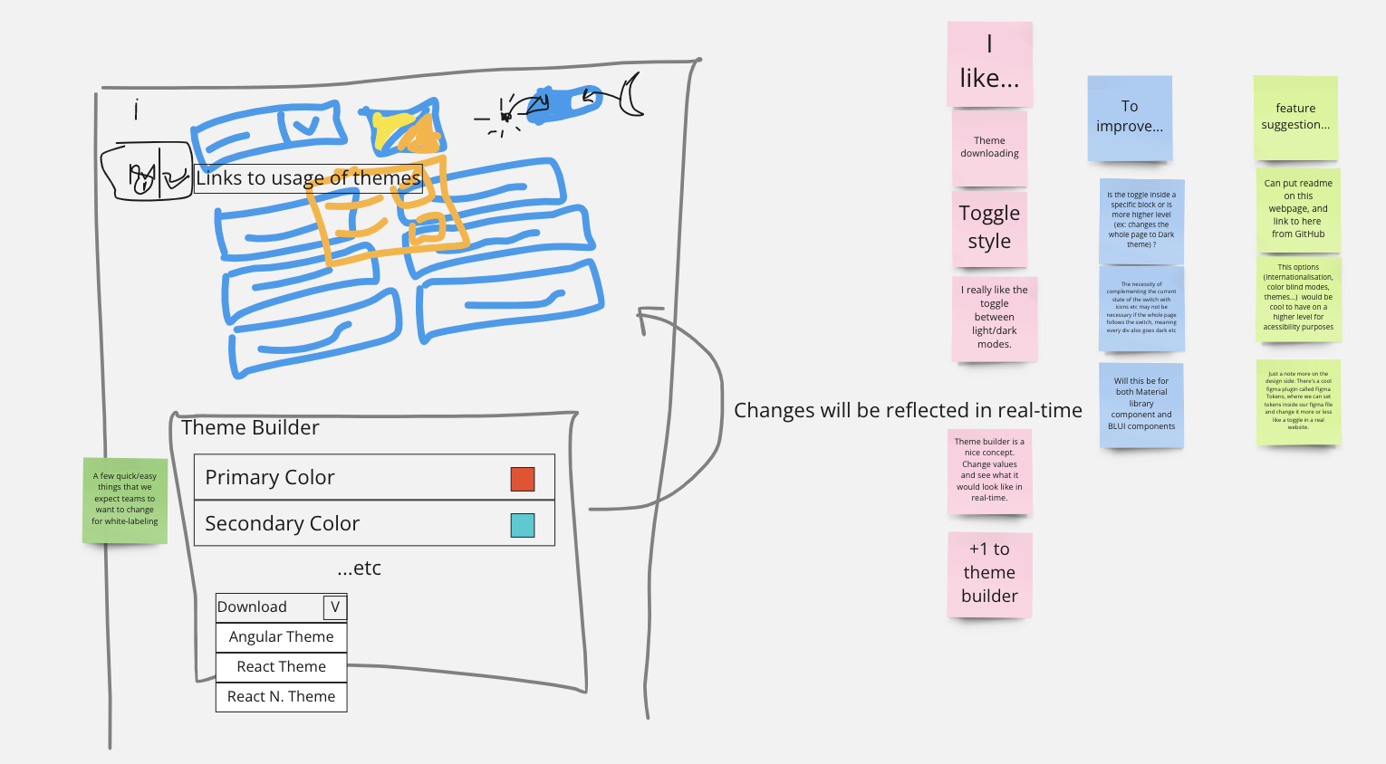
Mid-Fi Prototyping
Using what’s learned from previous sessions, we’ve identified two pages to prototype first — the pages that if they are missing from our documentation, our users would be unhappy.
I assigned my crews to do the easier one — a page describing how to apply theme colors from the developer side; meanwhile, I designed our components page, which had more complex user interactions.
I also made them went through “competitive analysis”, trying to determine how other design systems are displaying their API pages.
Participants
My 2 mentees and myself
What I Learned
My mentees initially attempted to use Figma, which shifted their focus from page contents and story-telling to building a visual layout.
They both received design thinking methodology training not too long ago, but didn’t absorb the spirit of “asking the right questions first”. This takes time to exercise.
By the time I noticed all these, it was too late. They already formed a high-fidelity solution. I tried moving their discussions to Miro so that they could think about problems more abstractly, but didn’t push too hard so that they do not lose interest in design.
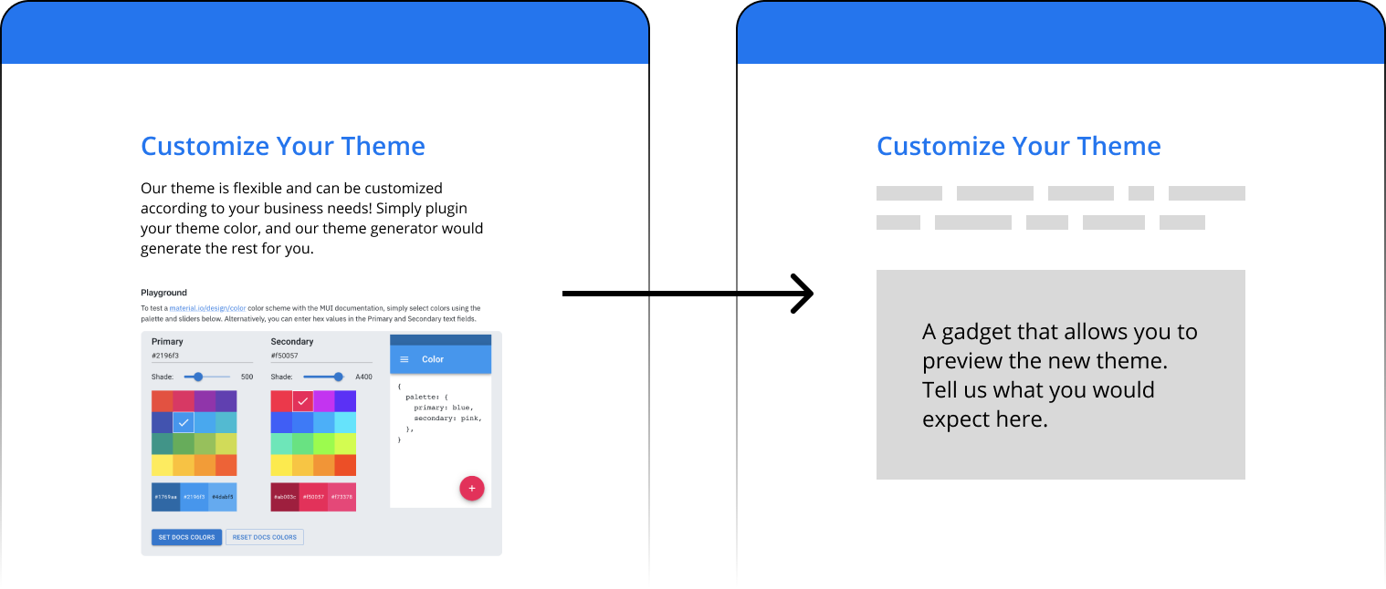
“This is not a demo. It should leave enough room for your testers to explore and imagine.”
I made them “downgrade” their prototypes from high fidelity to low fidelity.
Monitored User Testing
Despite having participated in many user conversations and received training on how to conduct user testing, my crew designers did not give me a satisfying user testing script at first. Instead of a handful of open-ended task that allows testers to explore and be open-minded, what they have was closer to a demo/walkthrough.
I requested them to cast out a lot of details from the prototype, leaving just a blank square with a brief text description. I also instructed them to modify their script, so that they not only asked positive questions such as “What do you expect to see here” but also negative questions such as “What is something you don’t want to see in the theme customization section?”
Participants
My 2 mentees
4 testers
What We Learned
Users favored grouping contents into tabs. They rather not see everything on a long page.
Users loved how we progressively disclose the content to instruct new users.
What I Learned
Unlike those typical everyday testers we recruit on userinterview.com, our testers were all engineers who tend to be on the quiet side. I should really devise tasks and follow up questions to really encourage them to speak their thoughts.

High-Fidelity Polishing
As we approached the end of the project, I took over my crew’s design and polished their prototype to pixel-perfect.
I also ran eight unmonitored tests on usertesting.com to ensure that our end result is not subject to some internal biases.
Participants
Myself
8 testers recruited from usertesting.com
What I Learned
It sure felt a lot easier when you were doing it vs. when your mentees were doing it :D
This is month three, and my mentees were showing symptoms of burnout and “just wanted to implement it”. Not all design steps are fun like running design thinking workshops. How to attain people’s interest in design in the long run remained an unsolved mystery on my end.
Reflection
The wins
I think this is a successful experiment in bringing developers to do design work. For me, the most critical skill set of a designer (which engineers tend to lack) is maintaining a user-centric mindset, instead of being the best pixel pusher.
Our manager also gave us full support doing this project. He knew that I can do everything faster, but he also believed it is important for developers to understand how design works.
The challenges
My crew’s mind is framed to “finding the best solution possible in the shortest time”, which is perfect for engineers or “problem solvers” but dangerous for designers or “problem analyzers”.
What I would do differently next time
Before handing out a task, I will communicate well to my crew what my expectations are. For example, if I want a mid-fi prototype, I will show my crew what a “mid-fi” prototype should look like but without doing all the drawings for them.
I will also stress that just gathering the research “artifact” is not enough. I am going to emphasize that a user interview is not a “face-to-face survey”, and that the way users reach a conclusion is more important than the conclusion itself.